Friday, 15 April 2011

Final Magazine Cover, Contents, Double Page & Evaluation


Music Magazine Evaluation
In my music magazine I have decided that I will follow the stereotypical conventions of a published magazine. For example, the masthead on my magazine is EQ, it is in a bold red colour with a thick black outline. I have chosen to place it at the top left as this is conventional for a magazine.
The barcode is to the top right hand corner.
The date will be in the top right hand side above the barcode.
The price is below the barcode in the top right hand corner.
The image of Hannah is in across the whole page, all light colours except her hair which is bright green which stands out, this is the eye catching feature that will sell the product.
The headlines are along the side of the image as I don’t want to take the attention away from the image.
I only have a one advertisement on the front page; it is a Facebook link to the magazines page.
The pull quotes on my front page are two quotes from Rihanna’s song and Bruno Mar’s song.
My magazine is a representation of not just one particular social group but to anyone who likes chart music. I show this by the image on the front cover as the model is 17 years old with a different look. When I was taking the picture I thought of a theme that would be different, and make her look sexy and irresistible. These is good for a music magazine because that is what people are looking for and are interested in, due to what society is like, and what teenagers are wanting to look like.
I would not use ‘Conde Nast’ as the institution to sell my magazine because it is a more sophisticated magazine institution. I also wouldn’t distribute with ‘Beauer Media’ because they have two successful music magazines, one of which has the same genre as my magazine, therefore I wouldn’t want to create competition for the company’s existing magazine.  I would use IPC Media to distribute my music magazine, because although they have a successful magazine ‘NME’ the genre of that magazine is different to mine, therefore it would be competition for NME or my magazine. 
I used Adobe Photoshop  to produce my magazine, I had to learn how to use the features of Photoshop, for example when I started my magazine, I wanted to cut the main focus of the photo out from the background, and I looked through the tools and found the ‘quick selection tool’ this then magnetises around the outline of the photo and then you press delete and the background will be erased.
Google – I used Google when conducting my research to decide what genre my magazine was going to be, by looking at other magazines, and see what my competition would be. 
After looking at my college magazine that I produced for the preliminary task, I can see that after learning more about Photoshop I am now able to produce better quality images, with outlines, and different effects on it.

Wednesday, 8 December 2010

Front Cover Drafts

What i need to change on this front cover is the font of the text, except the masthead. Also the positioning of some of the text as you can't read it because it is being blocked by something else e.g. the model, or the colour of the background.

Thursday, 18 November 2010

Front Cover Drafts

 This is a rough idea of what i want my front cover to look like.


Here is another idea for the front cover.

Tuesday, 16 November 2010

Research

Colour scheme

 Media that advertises chart music uses bright colour schemes as you can see from this cd cover of NOW 77. For my magazine i will be consistant is using colours that are eye catching. For example, red, blue, yellow.


Publisher

NME Front Cover
I have decided that I am going to publish my music mmagazine through IPC Media. This is because as I have looked through the brands that they publish, there is only one music magazine, which is NME  and that magazine is nothing like a charts magazine, so I would be expanding IPC's range of music magazine. I am not going to publish through bauer media because they publish alot of music magazines that are the same genre as mine, so it would be competition for my magazine.

Another option would be to self-publish it, however, as I don't know how well the magazine will sell, meaning that if it doesn't take off, I will have invested alot of money in it, and I would loose all that money.


Market Research


Front page
The masthead is clear and distinct, however is slightly blocked by the image. Yet this doesn't affect it because the magazine is well known and people know that if you see 'KERRA' that they are looking at 'Kerrang'  The colour scheme of this front page is black, white, yellow and red. The main text e.g. masthead and main feature are in white on a colour background, this is so it stands out. On the left-hand side there are two boxes with some features of the magazine and again the main writting is bold but in black this time on a white background. The section that is in red 'DOWNLOAD 2010 POSTER SPECIAL' is like this to get the audience to notice the information that benefits them.
The language on the front cover is simple and understandable. Audience profile for Kerrang: "Individually minded, independent of thought and musically experienced, an audience defined by attitude, passion and loyalty". (taken from www.bauermedia.co.uk/Brands/Kerrang)


Contents
 There is a consistant colour scheme following on from the front cover. The majority of the text on the contents page is on a white background with black writing. The image they have used is from a concert of greenday, which they show by having a caption 'Green Day' with the page number that they are going to feature on.


Double page 2


Wednesday, 10 November 2010

front cover idea

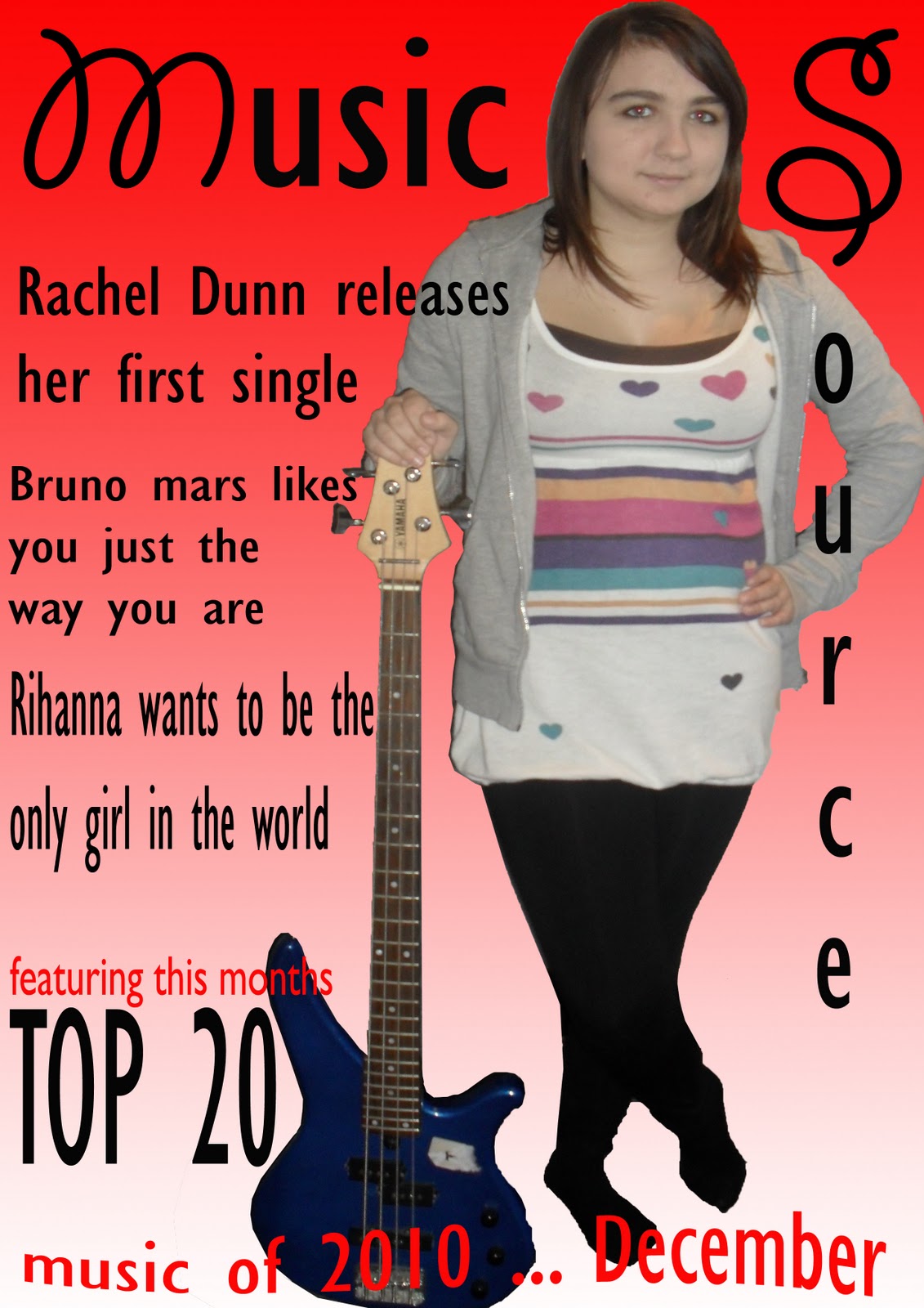
This is an idea for the layout and contents using the another name 'Music Source'. For the features, I have played on the artists songs names, and made it a sentence. For example, Bruno Mar's song is called 'just the way you are' and I have linked it so the magazine is interacting with the reader by say 'Bruno Mars likes you just the way you are' and by using the personal pronoun 'you' it makes the reader feel like the feature has been written for them.

Again I have directed the words at the audience by writing 'Be part of YOUR music world' making out as though it isn't just any music world it is their music world.

For the issue I have written 'Music of 2010' which can appear on each months magazine, and then all I have to edit is the month e.g. 'December'.

Ideas for the magazine name

  I have put the 'turn it up' as a tag line, this is because some people may not know the defintion and the relevance that 'forte' has to music.

Genre for my magazine

Chart music, because I personally listen to not one particular genre of music, I like to listen to recent music e.g. things you hear on the radio, tv talent shows, pubs and clubs.

Thursday, 4 November 2010

Name Ideas

These are my first set of ideas for the name of my music magazine. 
I have got these from music technology terms.

Wednesday, 3 November 2010

Interpretation of The Brief

L - My front cover will have a masthead that is bold and simple to understand. I will not have an image covering the masthead, as I want the reader to focus on the the name of the magazine and the headlines. I think the best camera angle for my image is not face forward, but sort of side shot so they aren't the main focus. The colour scheme i am thinking about is...

I - I am going to research into different publishers to decide which company would be the best to sell my magazien through. The three I am going to look at are IPC Media, BAUER Media and Conde Nast.
I - The Genre for my music magazine is Chart Music, this is because I personally like listening to recent songs, things that I hear on the radio and television. 

A - My target audience is going to be anyone who is interested in chart music, but mainly people in the age range 15 - mid 20's.

R - My target audience will be respresented by the language I use and the images that will appear on the front page, contents and double page spread. The genre will be represented by talking about the months top ten, have a wide range of images etc.

The Brief

Create the front page, contents and double page spread of a new music magazine. using only original images and text. minimum of four images.You must use digital images and your final product must be produced in adobe photoshop.

Sunday, 24 October 2010

Evaluation.

     I think that my final front cover and contents page was a success. As I had a consistent colour scheme of lime green, purple and light grey, throughout. I used the same font one the front and the contents page, the text I wanted to stand out more, I used the layer effect ‘stroke’ which puts a thicker edge around the main text, for this is used the light grey around the purple writing on the lime green background.
     I placed my image on the front cover at the left hand side because I wanted to place the text alongside the image. I took the pictures using a digital camera and I captured the picture in the library of Wyke College. The image on the contents page was taken in the reception area in front of guidance, as this is a big part of the college. I found editing my images okay, as they both had a solid edge so I used a tool on photoshop that goes along the edges of the image so you can edit or delete the unwanted background.
     My reasoning for calling the magazine ‘WCCM’ is that it stands for Wyke College Community Magazine and at Wyke the staff and students are like a community in itself. Also the intention of the magazine is to inform students and staff of what is going on within the college, which is almost like city newspapers e.g. Hull Daily Mail, as they update the city people of what is going on where they live.
     The headlines I have written on the front cover are about what is going on within the college in the next year. I wrote them short and snappy so people reading it understand it, and also so there wasn’t too much text.
     Overall, I think that my front cover and contents page is a good effort, and I am pleased with the outcome. However, if I were to do it again, I would plan it a lot better and thought about how the layout and contents could be used more effectively, I would use a few more images on the contents page, and a bigger variety of text fonts and colours. Perhaps the background was slightly too bold, however I would only change the colours not the actual style. 

Friday, 22 October 2010

content images

Images I haven't used for my contents page.


This is the image i did use.


Wednesday, 20 October 2010

Contents

Drawn Draft (1st)

(image to be inserted)


Publisher Draft (2nd)

Photoshop Copy (3rd Draft & Final)

Image to go on contents page.

Contents page image.. not using
First Idea

I have chosen to use this image because it shows a big part of Wyke. Advertising it, and also making students when they look at the contents page remember that Guidance is there when and if they need it. 

I have also carried on the colour scheme so that it is consistent, and it looks professional. I have also used the same font as the front cover. 

I will have the front cover headline alongside the page numbers, this is because I am placing the text in the same style as the cover, down the side of the image. 

On the word 'Content' I have used a tool on photoshop to create an outline so the masthead stands out on the page. I have also done this on the cover on the masthead 'WCCM wyke college community mag' and also 'Autumn 2010'. When I have done this, I have used the grey/white colour that i used in one of the blocks of the background.

This is my final Contents Page.

Final Edited Contents Page