I think that my final front cover and contents page was a success. As I had a consistent colour scheme of lime green, purple and light grey, throughout. I used the same font one the front and the contents page, the text I wanted to stand out more, I used the layer effect ‘stroke’ which puts a thicker edge around the main text, for this is used the light grey around the purple writing on the lime green background.
Sunday, 24 October 2010
Evaluation.
Friday, 22 October 2010


Wednesday, 20 October 2010
Contents
Drawn Draft (1st)
(image to be inserted)
Publisher Draft (2nd)

Photoshop Copy (3rd Draft & Final)
Image to go on contents page.
 |
| Contents page image.. not using |
 |
| First Idea |
I have chosen to use this image because it shows a big part of Wyke. Advertising it, and also making students when they look at the contents page remember that Guidance is there when and if they need it.
I have also carried on the colour scheme so that it is consistent, and it looks professional. I have also used the same font as the front cover.
I will have the front cover headline alongside the page numbers, this is because I am placing the text in the same style as the cover, down the side of the image.
On the word 'Content' I have used a tool on photoshop to create an outline so the masthead stands out on the page. I have also done this on the cover on the masthead 'WCCM wyke college community mag' and also 'Autumn 2010'. When I have done this, I have used the grey/white colour that i used in one of the blocks of the background.
This is my final Contents Page.
This is my final Contents Page.
 |
| Final Edited Contents Page |
Final Front Cover
This is my final front cover for the Wyke College Magazine.
 |
| Final Cover with corrections made |
 |
| Front Cover with mistakes |
Language: Simple, Easy to read and understand. Using the conventions: Masthead, Logo, Slogan, Headlines, Features, Images.
Institution: Wyke Sixth Form College.
Ideology:
Audience: This magazine is aimed at the students of Wyke Sixth Form College ages ranging from 16 onwards. As there are a few adult students, and students that have re-sat years, or in some cases international students that have to learn from the beginning and spend up to 4 or 5 years at Wyke.
Representation: I have used the Wyke colours so that when people see it they will relate it to Wyke College. The image shows that the magazine is for a college, as it has a student reading. Also relates to Wyke College by having the logo.
Tuesday, 19 October 2010
Second Draft
After looking at my first draft I realised that my image needed to be larger so it was the main focus point. I have enlarged the image so it fits across half of the page and I will put the headlines down the side of the model, so the layout flows rather than having them one way, picture another, or over-riding the masthead or the image.
 |
| This is the second draft with the image larger. |
Monday, 18 October 2010
First Draft & Images
 |
| front cover so far |
This is the idea of the front cover. I still have to add some details, e.g. date, issue, possibly another image, the magazine will be free, therefore I don't need to put a price on. I may put a couple of words that relate to the college and/or some of the things that are going to feature in the magazine.
I have used this colour scheme as these are the colours of Wyke, which are also used on the website so that members of the public that may be interested in Wyke will recognise advert when they see them because of the consistent colour scheme of lime green, purple and grey.
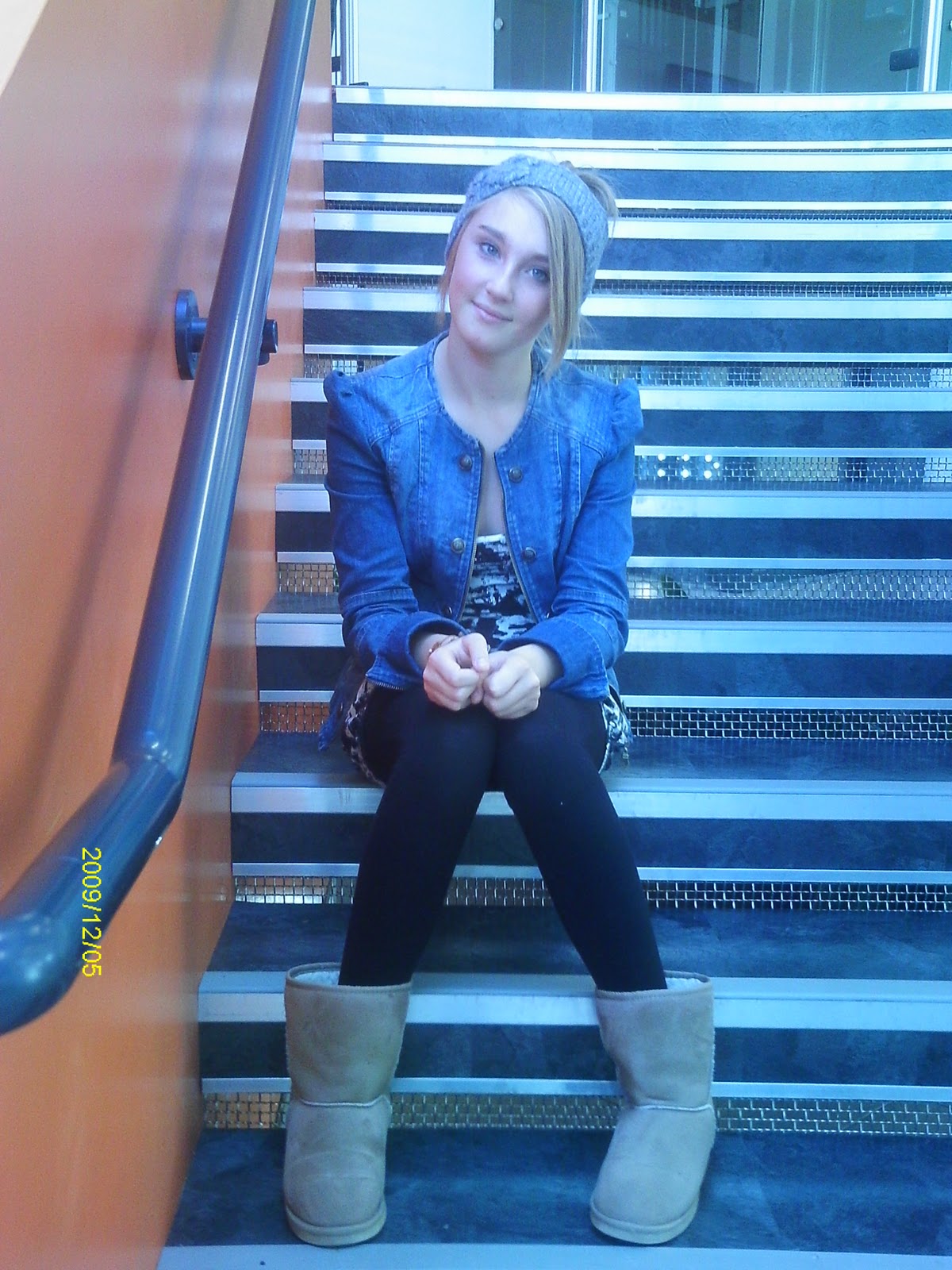
Here are some images that I have taken to go on the front cover. The reason I have chosen the one I have is because it fits well in the space, you can see the models face and also she is showing that the magazine is for a college as she is reading a book, not doing her make-up, which is what may appear if i were doing a fashion magazine.


I haven't used any of these pictures due to bad lighting, wrong angle and incorrect close-up shot.

I have used this image because it focuses on the top half of the models body, therefore the main focus in on her face. Yet I haven't taken the photo with the model looking directly at the camera because I didn't want the reader to be looking into the eyes of the model because I want them to read the headlines and not be too distracted my the image but still appreciate it. This is because we almost always will look into the eyes of someone that is in front of us, which is why Animal Rescue adverts for example, always have a close up shot of the animals face, so you are distracted my the reality of the thing you are seeing.
I have edited the picture so that I don't have the background in and the image fits on to the front cover without blocking out any of the text with unnecessary background (the library & chair).
Friday, 8 October 2010
Layout Idea

I plan on putting an image I have taken to the left side of W.C.C.M.
The images I have taken are located in the library of a wyke student.
Tuesday, 5 October 2010
Research
During the lesson, as a class we looked at some examples of college magazines (Grimsby and East Riding). The problems that I noticed with their magazines, were small, but very effective, for example, the colour scheme on both of them were not consistant. Some pages I was unable to either read the text or even see it. Some images used we're not relevant to the rest of the content, and occasionally blocked out part of the masthead or feature headlines, distracting me from the intended main focal point. Both magazines are aimed at college students aged mainly 16 - 19. They both contain student issues, teenage issues and college issues and trips.
 |
| East Riding College Magazine |
 |
| Grimsby Institute Magazine Front Page |
Brief
Preliminary exercise: create the front page of a new college magazine, using an original photo, along with some text and a masthead. Also create a mock up of the layout of the contents page.
Deadline: 15th October 2010 Extension: 22nd October 2010
Main task: the front page, contents and double page spread of a new music magazine. using only original images and text. minimum of four images.
Deadline: 15th October 2010 Extension: 22nd October 2010
Main task: the front page, contents and double page spread of a new music magazine. using only original images and text. minimum of four images.
Subscribe to:
Posts (Atom)